![]()
Excel tutorials ranked from easy to more advanced, with added video goodness.
![]()
Excel tutorials ranked from easy to more advanced, with added video goodness.
Silk is a really simple tool for creating visual stories. Text, images, video and audio can be included, and templates are provided for building interactive graphs and other data visualisations. Quick and easy. It’s used by The Guardian and New York magazine.
Humorous and clever use of Silk: Women in Film: A Data Analysis of 1500 Movies on Bechdel Test Criteria

Piktochart describes itself as an ‘easy-to-use infographic creator’. There are paid plans, but also a more limited free account.
A gallery of Piktochart examples is here.
Free software that turns data into visual stories.
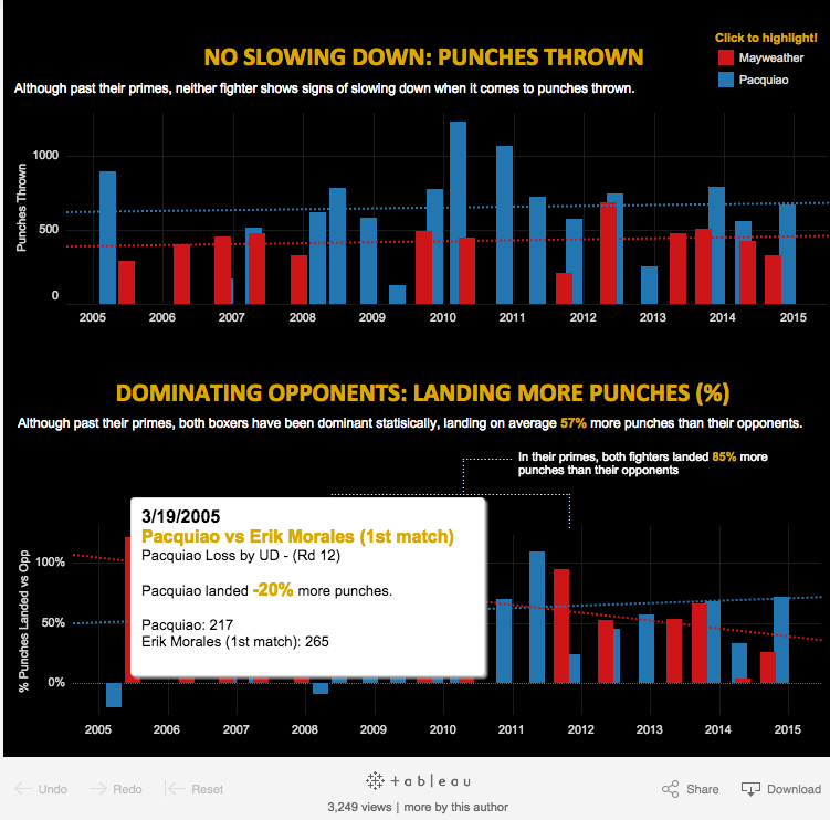
More examples of interactives built using Tableau:
Dan Nguyen’s gallery
Tableau gallery
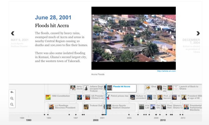
An open-source tool for building interactive timelines.
Media from a variety of sources can be used with built-in support for Twitter, Flickr, Google Maps, YouTube, Vimeo, Vine, Dailymotion, Wikipedia, SoundCloud and more.
(From ‘How It Works’ at http://timeline.knightlab.com/)
Some examples using Timeline JS:
Al Jazeera – Timeline: Egypt in Turmoil
Time – Nelson Mandela’s Extraordinary Life: An Interactive Timeline

Independent data journalist and information designer David McCandless says his passion is presenting information with a minimum of words.
His site is worth exploring for its adventurous ideas, and the beauty of some of the designs. He emphasises the importance of ‘juicy data’ – in other words, data that’s absolutely accurate. And, he adds, 80 per cent of the work that goes into a great graphic is gathering the data, organising it and checking.
In one or two of the visualisations beautiful design acts to confuse the information a little, I think. But where he gets the balance right he gets it really right.
An interesting one to start with is Who Likes Whom in the Middle East, a visualised network of the complex relationships between the different players in a highly volatile region.
From journalism.co.uk – some of McCandless’s tips for using visual data.
You can find more interactives here. And follow McCandless on Twitter here.

A selection of mostly free data visualisation tools. Consider this just the beginning; I expect we’ll add to these as we progress. You can add any you discover in the comments below or email me and I’ll post them.
https://www.journalism.co.uk/news/data-viz-tools-for-covering-the-uk-general-election/s2/a564781/

